http://vimeo.com/user9309836
Thursday, December 1, 2011


Monday, February 21, 2011


Monday, January 17, 2011


Sunday, January 9, 2011
Tutorials & codes
Tutorials
text effect: http://www.photoshopsupport.com/tutorials/cb/halftone.html
http://www.webdesign.org/photoshop/tutorials/page-1.html
http://www.tripwiremagazine.com/2009/02/tutorials-on-photoshop-website-design-and-psd-to-html.html
part1:http://www.hv-designs.co.uk/2010/04/23/learn-how-to-create-a-pop-up-style-css-navigation/
part2:http://www.hv-designs.co.uk/2010/04/29/learn-how-to-creare-a-pop-up-css-navigation-pt-2/
http://www.1stwebdesigner.com/tutorials/22-photoshop-web-design-interface-tutorial-sites/
Code
http://www.freecodescript.com/
http://www.dynamicdrive.com/
http://www.htmlcodetutorial.com/quicklist.html
Nice webpage design
Academy
http://www.weareacademy.com/page/projects/


http://www.weareacademy.com/page/projects/


: )
-nice content arrangement
-playful but clear
Samsung Card

: )
-nice content boxes(button), image and text
Taipei 101


: )
-look high class
-nice button
-creative at the taipei 101 building photo web page(user can see the different scene by controlling the time line)
Shop Curious


: )
-nice typography
-nice button effect
-classic
Competitor website
Bangsar shopping centre
http://www.bsc.com.my

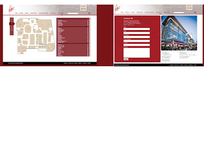
1 utama
http://www.1utama.com.my/welcome.aspx


: )
-color are clean and comfortable
-nice floor plan button
: (
-webpage is align left (right side too empty)
-length of the text too long, hard to read
-lack of images
-table can be improve
The garden
http://www.midvalleygardens.com.my/gardensmall/default.html


: )
-look high class
-clean and clear
-nice images
: (
-length of the text too long, hard to read
-button and table can be improve
Pavilion
http://www.pavilion-kl.com


http://www.bsc.com.my


: )
-look high class
-nice wireframe
-nice typography arrangement
-have a lot of image support the content
: (
-button can be improve
http://www.1utama.com.my/welcome.aspx


: )
-color are clean and comfortable
-nice floor plan button
: (
-webpage is align left (right side too empty)
-length of the text too long, hard to read
-lack of images
-table can be improve
The garden
http://www.midvalleygardens.com.my/gardensmall/default.html


: )
-look high class
-clean and clear
-nice images
: (
-length of the text too long, hard to read
-button and table can be improve
Pavilion
http://www.pavilion-kl.com


: )
-nice title graphic
-nice images to support the content
: (
-wire frame can be improve
-button and typography can be improve as well

Cilent Websites (Mid Valley)


-clear and clean
-using different color for button/ category (user friendly)
-nice wire frame, each web page is using the same arrangement(images at the left side, content at the right)
: (
-the main page button don't function well
-text(sub-button ) in the image not clear
-color mood can be improve
-too much text ,lack of images for user to find thing or shop they want.


Subscribe to:
Posts (Atom)